I was recently asked to do a panel of grouped boxplots of a continuous variable,
with each panel representing a categorical grouping variable. This seems easy enough with ggplot2 and the facet_wrap function, but then my collaborator wanted p-values on the graphs! This post is my approach to the problem.
First of all, one caveat. I’m a huge fan of Hadley Wickham’s tidyverse and so most of my code will reflect this ethos, including packages and pipes. There are, of course, other approaches to doing this.
library(broom)
library(ggplot2)
library(tidyverse)
## ── Attaching packages ──────────────────────── tidyverse 1.3.0 ──## ✓ tibble 3.0.1 ✓ dplyr 0.8.5
## ✓ tidyr 1.0.2 ✓ stringr 1.4.0
## ✓ readr 1.3.1 ✓ forcats 0.5.0
## ✓ purrr 0.3.4## Warning: package 'tibble' was built under R version 3.6.2## Warning: package 'purrr' was built under R version 3.6.2## ── Conflicts ─────────────────────────── tidyverse_conflicts() ──
## x dplyr::filter() masks stats::filter()
## x dplyr::lag() masks stats::lag()I will use the warpbreaks dataset as an example. This data looks at the number of breaks in yarn, for two types of yarn (A and B) and three loom tensions (L, M, H)
data(warpbreaks)
glimpse(warpbreaks)
## Rows: 54
## Columns: 3
## $ breaks <dbl> 26, 30, 54, 25, 70, 52, 51, 26, 67, 18, 21, 29, 17, 12, 18, 3…
## $ wool <fct> A, A, A, A, A, A, A, A, A, A, A, A, A, A, A, A, A, A, A, A, A…
## $ tension <fct> L, L, L, L, L, L, L, L, L, M, M, M, M, M, M, M, M, M, H, H, H…A single panel
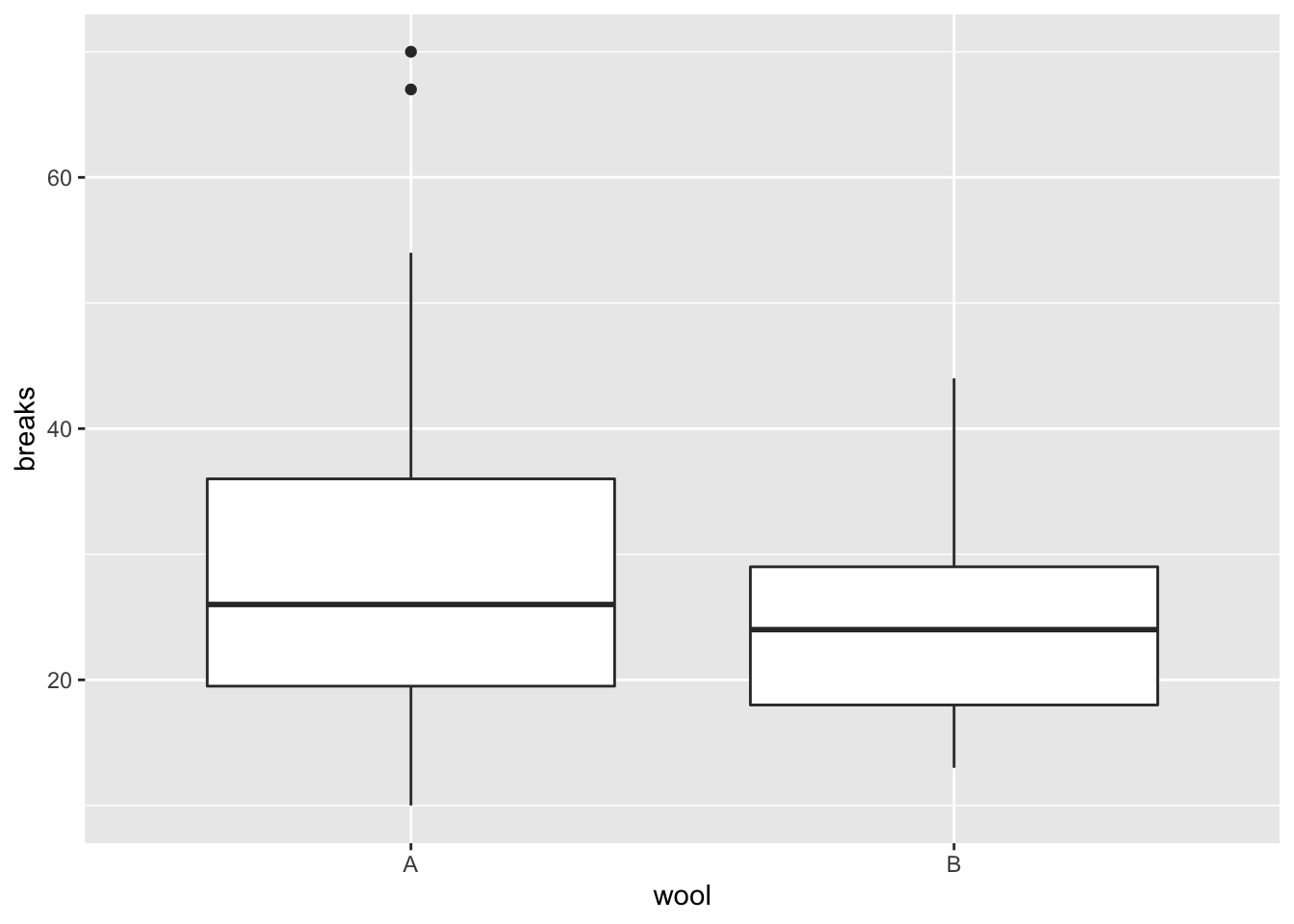
Let’s first start with creating a grouped boxplot of breaks by wool type. This is pretty straightforward in ggplot2.
plt1 <- ggplot(warpbreaks, aes(x=wool, y=breaks))+
geom_boxplot()
plt1
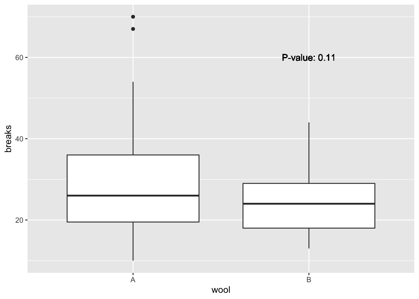
Adding the p-value to this is also rather simple. We will perform a two-sample t.test and report the p-value on the plot
tst = t.test(breaks ~ wool, data=warpbreaks)
pval = tidy(tst)$p.value # from broom
plt1 + geom_text(aes(x=2, y = 60, # Where do we put the annotation
label=paste('P-value:', format.pval(pval, digits=2))))
Multiple panels
I’ll now show how to do multiple panels. First, we have to transform the data into long format so that ggplot2 can leverage it.
warp2 <- gather(warpbreaks, variable, value, -breaks)## Warning: attributes are not identical across measure variables;
## they will be droppedhead(warp2)## breaks variable value
## 1 26 wool A
## 2 30 wool A
## 3 54 wool A
## 4 25 wool A
## 5 70 wool A
## 6 52 wool ANow we can plot this using ggplot2
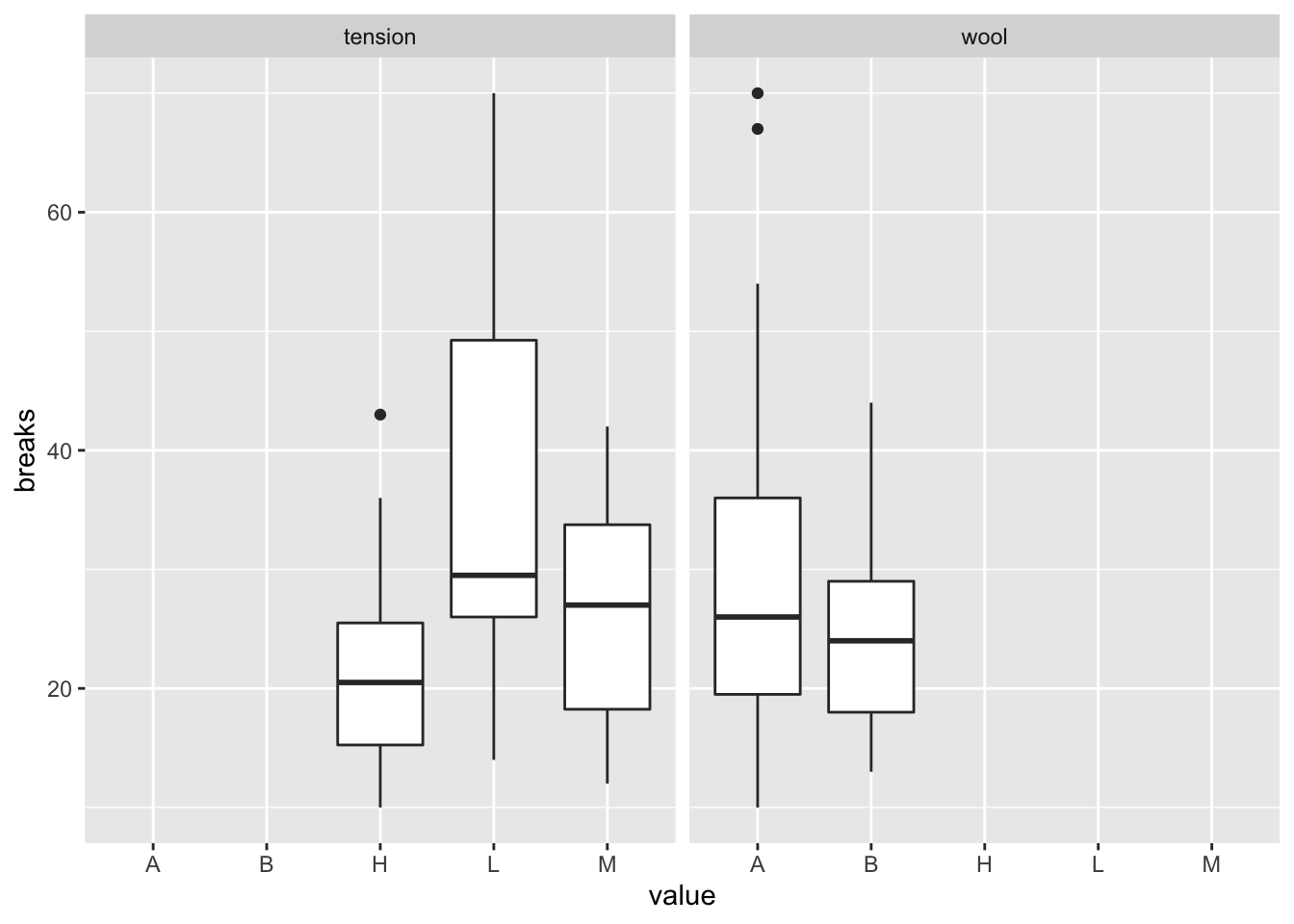
ggplot(warp2, aes(x = value, y = breaks))+geom_boxplot()+facet_wrap(~variable, nrow=1)
Ooops!! When we used gather to melt the data frame and create one variable for the two categorical variables, with the levels all shared in the variable column. So the plot shows all the possible categories. We can easily fix this.
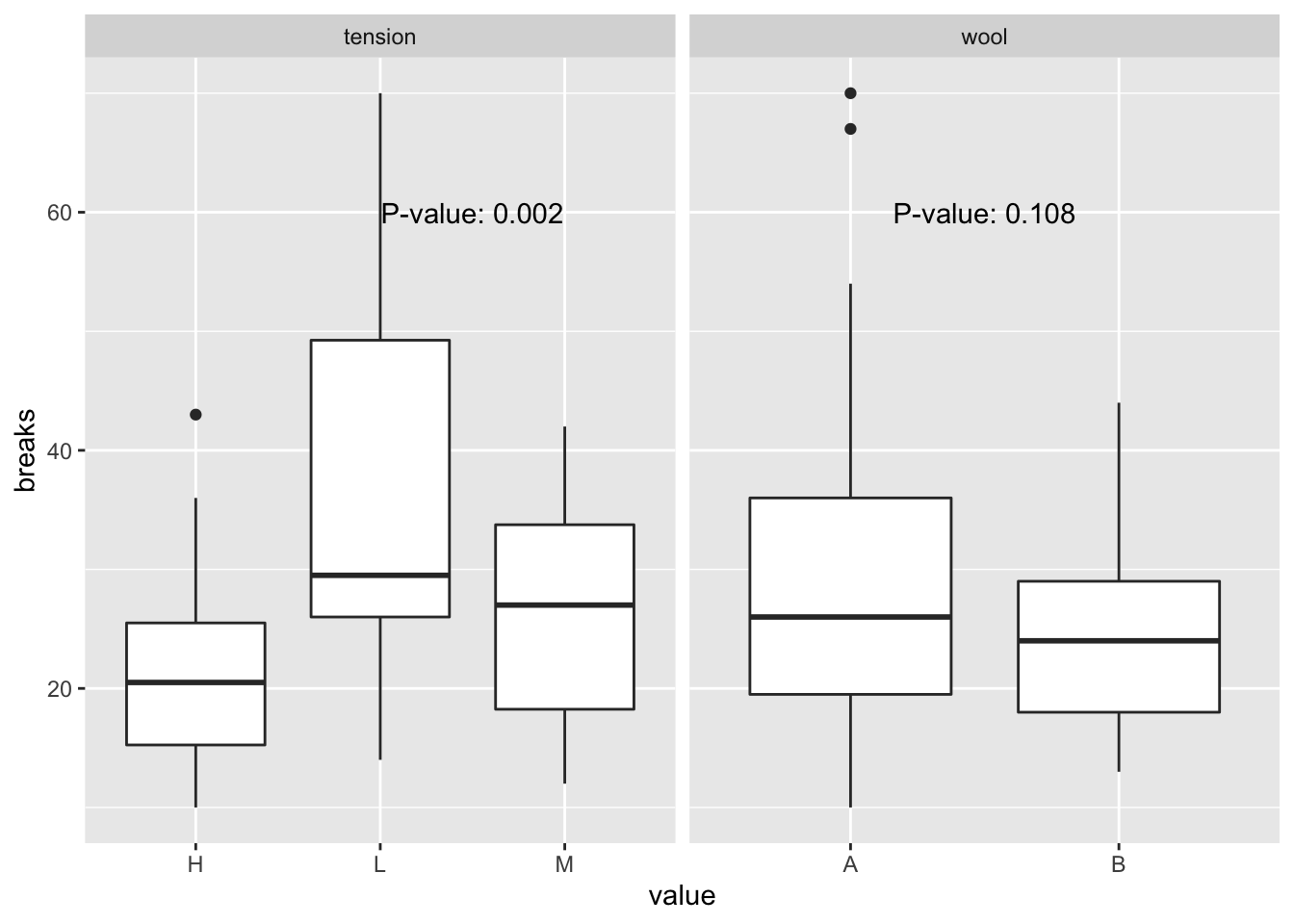
plt2 <- ggplot(warp2, aes(x=value, y=breaks))+geom_boxplot()+facet_wrap(~variable, nrow=1, scales='free_x')Next, we want to put a p-value on each plot. The trick is to create a new data frame for the p-values, with one row per level of the facetting variable. In our example, wool has two levels while tension has three, so to create one p-value per plot I’ll run ANOVA models and provide the p-value of the model effect, i.e., is there any difference in the average number of breaks by levels of each predictor. I’ll use the template Wickham suggests about running multiple models here.
pvalues <- warp2 %>%
nest(-variable) %>%
mutate(mods = map(data, ~anova(lm(breaks ~ value, data = .))),
pval = map_dbl(mods, ~tidy(.)$p.value[1])) %>%
select(variable, pval)
## Warning: All elements of `...` must be named.
## Did you want `data = c(breaks, value)`?pvalues## # A tibble: 2 x 2
## variable pval
## <chr> <dbl>
## 1 wool 0.108
## 2 tension 0.00175I’ll also include in this data frame (or tibble as the tidyverse calls it) the location of the annotation on each graph, using the same variable names as the graph
pvalues <- pvalues %>%
mutate(value = c(1.5,2.5), breaks = 60)
pvalues
## # A tibble: 2 x 4
## variable pval value breaks
## <chr> <dbl> <dbl> <dbl>
## 1 wool 0.108 1.5 60
## 2 tension 0.00175 2.5 60Now, let’s plot these onto the facetted plot
plt2_annot <- plt2 +
geom_text(data=pvalues, aes(x=value, y=breaks,
label = paste('P-value:',
format.pval(pval, digits=1))))
plt2_annot
Obviously, if we wanted to make this graph publication quality, we’d need to modify the labels and perhaps the background, but this example gets you to the point where you can put p-values onto facetted plots. In fact, there’s nothing special about p-values here; you could add any facet-specific annotation onto your facetted plots using the same template.